

Every year, I seem to struggle with new + creative ideas for my family’s stockings. So I combed through Amazon and found some awesome ideas that are sure to please your loved ones this year!
Alluring + Affordable Mirrors
The Most Captivating Green Paint Colors
The Coziest Light Neutral Paints
The BEST White Paint Options
SUNDAY SERIES #1: All About Paint
Holiday Gift Guides 2021
Whether you are an early bird shopper who likes to make their list and check it twice by December. 1st, or a perhaps a busy working parent who realizes on December 23rd that you have a few more people to buy for (me just about every year ahhhhhh!), it’s always helpful to get a little advice on gift buying! This year, I organized my curated gift guides by theme (“Dining + Cooking”.) instead of role (Father/Husband) because I think it’s actually easier to find great gifts that are perfect for your friends or loved ones that way! (Babies, kids, and teens are still separated.) As always, I love to include items from bigger stores along with items from small businesses, some local to my area…items that are unique, on-trend, and can be paired well as a collection!!
Happy shopping and happy holidays!! :)
Dining + Cooking


Teen Gifts


Outdoorsy Gifts


Spirits!


Sports + Fan Gear


Baby + Kids Gifts


Holiday Decor Boards 2021
Helllllooooooo Holidays!! Who else was ready for the holidays in like August?? We can’t wait to bring back the sparkly lights of the tree, pine tree and mulled wine candles, and all the nostalgic Christmas decor we love to see each year. Scroll on for our three curated decor boards for your holiday decorating…
Roaring 20’s Deco Glam
This vibe is all about bringing glamour, opulence, and sophistication - à la Jay Gatsby - to your holiday decor. Feathers, velvet, geometric shapes, and metallic sparkle create a bold and unforgettable holiday experience!


California Natural
With these curated items, you are embracing nature, greenery, and the look of found objects. Think gifts stacked on antique stools under the tree and a collection of ornaments in wooden baskets - unique and California laidback.


Traditionally Festive
Beautiful, bold red decor with natural, traditional elements. Knitted + jute fabrics, lots of pattern, and a sleigh for gifts complete this cozy, happy vibe.


All the Fall Beauty 2021
Traditional + Spanish Revival Kitchen and Laundry Room Remodel
We are so exited about our latest large-scale project!! This design started with a single inspiration element: a teal patterned tile with accents of rust orange and navy blue from Floor and Decor. There was much discussion of where this beautiful tile would be installed, and initially we were thinking of tiling the whole kitchen floor, Because this is a more narrow, galley-style kitchen, I proposed tiling the backside of the bar area and doing the floor in just the laundry area. The bar area is one of the focal points as you walk into the space, and I knew adding the tile there would be a big impact!
Another key feature to this design is the gorgeous custom copper hood from Rustica House. I was so excited that our clients weren’t afraid to go bold with the color! The color we chose pulls out the rust orange tones in the tile and really ties both of those key elements together. It was handmade and rush-aged to get this finished color tone, and we all LOVE it!


A few of my other favorite features are the butcher block countertops and backsplash, the built-in banquette seating, the pantry barn door (from Wayfair), and the tiled dog feeding area.. Our clients wanted to incorporate butcher block to warm up the space, so we decided to install that at the bar and sink area. Zach had the idea to create a backsplash with butcher block, too, and it turned out soooo awesome! He built the bench seating at the banquette with the same material and is working on building a. custom table to complete that area. Our clients also wanted an area to put their dog’s water and food bowls that was tucked away and easy to clean. So we created a nook area in the base cabinetry and tiled it with our feature tile!
We pulled the remainder of the space together with lighter neutrals to balance the intensity of the tile and hood. The countertops in the rest of the space are Perla Veneta leathered quartz from Bedrosian’s and the backsplash tile is from Floor and Decor. We also used copper and oil rubbed bronze accents to provide balanced warmth: the custom pendant lights are from Rejuvenation; the antique copper nook light is from Houzz; and the oil-rubbed bronze faucets + sink accessories, pot filler, and hardware are from Build.com. Our clients are thrilled with how everything came together, and so are we!!


Below are a few before and after photos so you can see the change! We took out a wall dividing the dining area from the kitchen and reworked the whole kitchen layout. We also took some space from a bedroom closet to add in a large pantry and have the ability to move the washer and dryer to allow for more cabinetry on the opposite wall. The functionality and efficiency of the new space is NO comparison to how everything worked (or didn’t work) for our clients before! Add in some warm brown leather barstools and woven window treatments (to be installed soon), and you have a beautiful Traditional + Spanish Revival space!


Introducing: Our Forty-Acre Farmhouse Project!
Sometimes in life, something comes along that you know in your bones is just right, something that you know you can’t pass up. If someone would have told me six months ago that we would be here now, I would never have believed it! Nonetheless, here we are…sitting on our new property, watching the sun sink into the hills, and it absolutely feels right. It’s HOME!!
Our Country Barn Christmas
Holiday Decor Boards 2020!
What. A. Year. So hard, in so many ways. But I have to say…when I hear people say they want to forget this whole year happened, I cringeeee a little - our Logan Posey joined our family this year! 2020 is a year we will certainly never forget, but also for some great reasons, too. :)
Nonetheless - bring on the holidays!! (However they may look this year.) We are ready to slow down, celebrate, and live in gratitude and gratefulness. So here they are, our three Holiday Decor Boards for 2020: Navy + Copper Elegance; That Natural, Sparkly Glow; and Polished Pastels.
NAVY + COPPER ELEGANCE
For those of you wanting some substance, color, and vivaciousness this year, this is the design scheme for you! It’s warm and inviting, rich and regal, traditional and nostalgic. Blue and orange are opposites on the color wheel, so this combo brings a lot of visual interest into your Holiday space!


THAT NATURAL, SPARKLY GLOW
If you are looking for a cozy, peaceful vibe this year, this is it! Whites, creams, silvers, champagnes and lots of different textures - exactly that Winter wonderland kind of feeling. I mean…don’t we all want that natural, sparkly glow, especially after months of staying at home?? :)


POLISHED PASTELS
Can’t decide between colorful and neutral? Decorate with beautiful pastel colors and you can have the best of both worlds. :) These product options are fun and playful, but also still feel fancy and refined. Meant to bring a little smile to your face and a little extra joy into your Holidays!


Cheers to your Holidays, however they may look this year!! :)
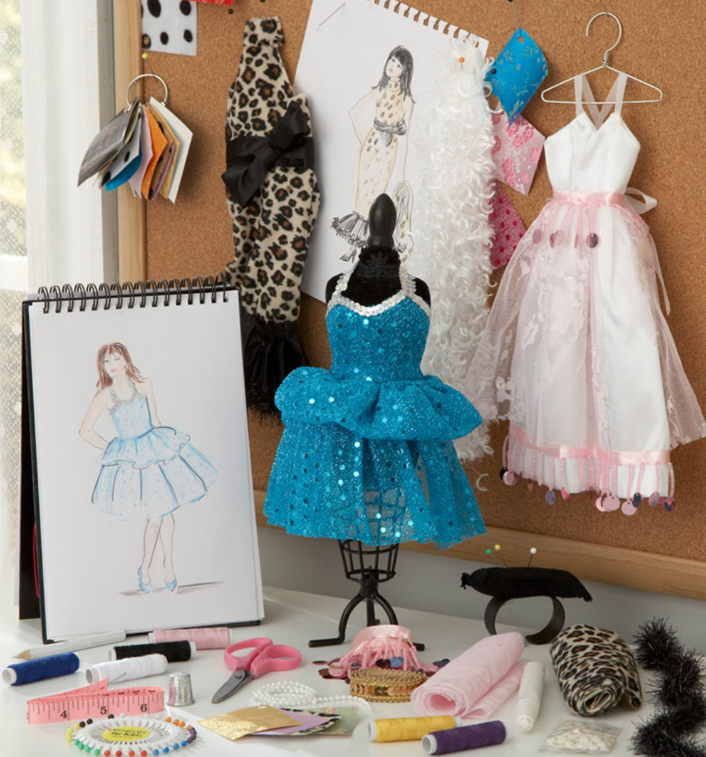
Fun, Functional Study Spaces for Kids + Teens!
Welcome to schooling in the year 2020! Many of us are learning how to teach our children, and some are learning to balance working from home WHILE teaching our children. That’s me, and I feel your pain…:)
While each of my big kids already had a desk in their bedrooms, full-day schooling in that space requires more than what we had. As I work to “remodel” their study spaces, I am sharing some of my favorite inspiration spaces with you! And a few key elements to a fun, functional kids’ study and work space. :)


Images above: left - IG @brynnnora; right - IG @shirabessinteriors
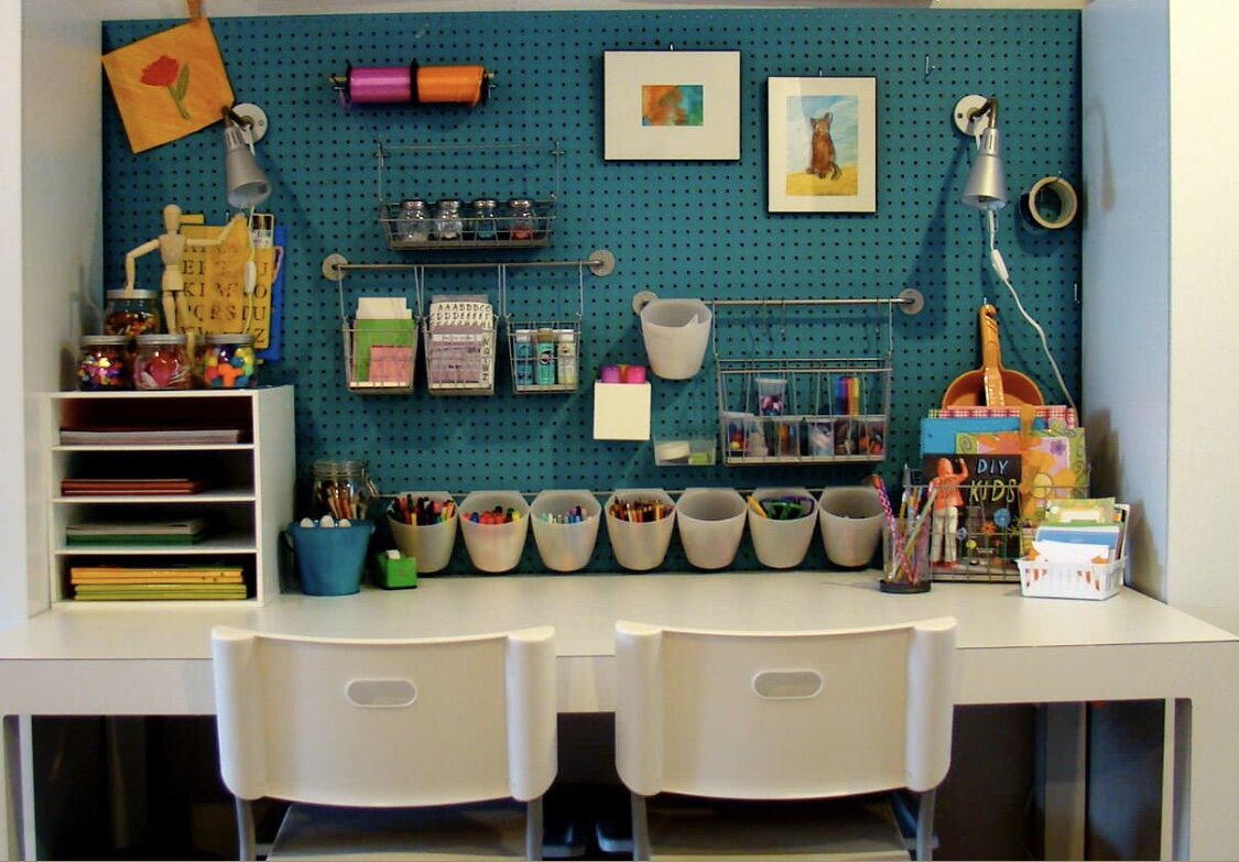
STORAGE: Ample storage is KEY! Even if your kiddos aren’t on a tight Zoom or Google Classroom conferencing schedule, they should be able to access the supplies they need in a hurry. I love the cork board wall (below right - posted by S. Connors on Houzz) - super functional and easy to change out/add lots of different types of storage! I also love a classic cubby shelf. The one below (left - Braun + Adams Interiors via Houzz) is painted a funky cool shade of turquoise! Baskets and doors/drawers allow for customization depending on your child’s’ needs. The upholstered bench and modern chairs are a beautiful balance of traditional and modern decor, and the star pendant light is so fun!

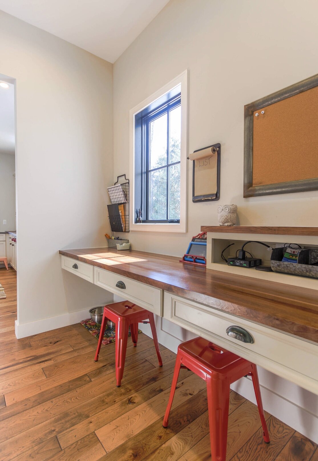
SPACE: Not all of us have enough room for a separate study space, including myself, but there are lots of ways to improvise! An unused nook area, space under the stairs, or a closet space can all be great options. The photos below
(right - IG @theorderlyspace, and left - Kathy Corbet Interiors via Houzz) are great examples of smart usage of space! I love the idea of dividers in the right photo - that can definitely help keep kids focused.


DESK: You can also get very creative when planning out a “desk” space. I adore the treehouse desk in the below right photo! (IG @tanjavanhoogdalem) My son would love to study in a space like that. And the creative desks in the next three photos are on the easier side to build and could be totally customized to fit the space they are in. (Below left - IG @three.little.poppies; bottom left - Dream Kitchens via Houzz; bottom right - Arianna Sabra Interiors via Houzz)


SENSORY DETAILS: The last element to consider is the senses: how does the space feel and sound, what is the vibe, what is your goal? (Besides studying, of course.) No one knows your child better than you! What makes your child learn best: bright colors and lots of stimulating textures, or calming, muted tones and a white noise machine? Do they need a place to get comfy in, or a place to help them stay focused? Little details can make a space really wonderful and personalized for your child.
(Photos below: left - IG @puresaltinteriors, image by @vlentine; right - Allan Ward Architects via Houzz)
Whatever space you have and whatever your budget, there are lots of ways to make your child’s or children’s spaces(s) feel special, cozy, and inviting for the learning ahead!


One Room Challenge Spring 2020 - Outdoor Patio
Baby Logan's Nursery
This may sound strange, but from the time I found out I was pregnant I was expecting to find out I was having a girl. For quite a few years, I had had a recurring dream about a baby girl, and I just. had this feeling that this was my baby girl from those dreams. Sure enough, we found out the kids were getting a baby sister! So when my design assistant/daughter Sofia and I started to talk about plans for the baby’s nursery, I knew I wanted it to feel dreamy, magical, and ethereal. We both love boho style but also like modern touches. And we loved the neutral toned nurseries we kept seeing on Instagram and design blogs, but we also wanted to make her room unique and special, just like we knew she would be.


Our first design boards (shown above) were close to what we wanted, but not quite there yet. The third board is definitely the closest to where we ended up, with the neutrals, light pinks, golds, and natural textures.
Just like with all of my designs, I started with an inspiration piece from which I could build a unified color palette. Early in the design brainstorming process, I found a beautiful rug from Boutique Rugs that I fell in love with. This rug would bring in just a bit more color like we wanted and had a gorgeous boho/vintage feel. From that rug, I pulled a light blush color that would be used in her bedding and a deep wine color that would be used in the draperies. I found a super luxe velvet quilt from West Elm x PBK (on sale, too!) and some thick, room-darkening. draperies from Wayfair that come in tons of colors and sizes.


As for her walls, I came up with a few creative ways to decorate. Initially, I had my heart set on an abstract painted wall mural like the picture in design board #3, but I realized that it was just not in the budget. So we bought some wall tiles off of Amazon and created a framed wall piece from the tiles (and when I say we, I really mean my husband’s mad skills made that come to life). We mounted a custom wooden name sign from 1801 and Co on the front of the tiles and added an antique crown on the top.
I knew I also wanted a little bit of gold in the space, so I bought a pretty gold mirror from World Market to hang over the IKEA changing table/dresser. The rest of that wall came together slowly, mainly because I had electrical connections available for only one wall sconce. I really wanted a sconce on either side of the mirror, but the time and expense required to make that happen didn’t make sense. So I designed around what I had! The result was an asymmetrical, fun grouping that came from a lot of trial and error. Balance in design is what really makes a space look pulled together, so I wanted to make sure I balanced the items as a whole look since there would not be symmetry in just the lights and mirror. I paired a few larger items (like the wooden shelf with marble inlays) on one side with more smaller items on the other side. I made sure I had some gold elements paired with neutral/natural elements here, too, and I brought in more of those blush tones by using some of her little outfits and bows.


The wall sconce was also a challenge for me because I was really looking for a specific size and look. The one I ended up with is from Shades of Light (my favorite online lighting supplier) and has just the right amount of antique silver and gold in it, The chandelier also needed to be a particular size, and while I adored the woven drum lights I was finding, I wanted something a little more modern. I found a great one from Amazon that is so funky and cute! I can’t wait to hold her under it and spin it around while she stares at all the little tassels.


I also hung a few wall shelves in another grouping to display some of the books that her room is packed with because I love reading to my babies! Sofia and I made a hanging mobile for above the bean bag chair with some fun sheer ribbon in those same dusty mauve tones and Capiz shells from Amazon. We are pretty proud of how this piece turned out, and it was fairly simple, too!


With the crib, I had my eye on a particular one early on from Babyletto that is GREENGUARD Gold Certified and am so happy that I went with it! It was easy to put together and the white + light wood are perfect. I chose a plain white flannel sheet for softness, and I couldn’t find just the right crib skirt so I used a blanket that I bought for my wedding! The glider is from Wayfair - it is so comfy and the fabric is a nice, chunky weave that seems like it should hold up well (fingers crossed!). I also found a large bean bag chair on PB Teen that matched the quilt fabric; I wanted to plan for some extra seating in her room because I anticipate that’s where we will all spend quite a bit of time. The wicker end table was a surprise find at Marshall’s, and I love it! I added in some other warm tones with baskets for storage, and the balance between modern gold touches, shades of blush and wine, and natural textures is exactly what we wanted. I finished up the space with cute blankets from Ikea and Little Giraffe, pillows from Home Goods, and stuffed animals passed down from the bigger kids, who are so excited to meet their sister.
And it feels cozy and dreamy and soft, just like we wanted.


Our 2019 Holiday Decor Boards: #3 MODERN MOUNTAIN
Decor Board > a curated collection of items that complement each other in theme, harmony, and color tone.
Modern Mountain is our final 2019 Decor Board! For this collection of holiday decor items, we wanted to elicit a cozy, comfy vibe that felt modern and fresh at the same time. Modern design is all about straight, geometric lines; minimal, unfussy features; and, surprising to some, lots of natural elements. When done purposefully, this style pairs very well with the rustic textures and unpretentious warmth of mountain/rustic style. Our color palette here is all earthy: greens, creams, metallics, and blacks.
Inviting. Refined. Serene. Sophisticated.


Our 2019 Holiday Decor Boards: #2 WHIMSICAL WONDERLAND
Decor Board > a curated collection of items that complement each other in theme, harmony, and color tone.
For our second 2019 Decor Board, we bring you: Whimsical Wonderland! This fun, colorful group of holiday decor items evoke feelings of nostalgia and childhood. In keeping with a more eclectic design style, there are lots of bright colors, unique items, and playful elements. To keep the look cohesive, we kept the color palette focused on similar tones of turquoise, red, and gold, with touches of purple and green.
Cheerful. Enchanting. Vibrant. Merry.


Our 2019 Holiday Decor Boards: #1 BOHO BLIZZARD
Decor Board > a curated collection of items that complement each other in theme, harmony, and color tone.
For our first 2019 Decor Board, we bring you: Boho Blizzard! This group of holiday decor items embody a warm, cozy vibe paired with snowy, wintery, shimmery holiday fun. As with Boho design style, there are lots of textures, natural elements, and eclectic features. But the color tones are more evocative of Scandi Boho and a woodsy winter wonderland - warm whites, bright creams, and neutral tans.
Earthy. Creative. Artful. Cozy.


All the Fun Fall Rugs!
I love rugs…accent, outdoor, area, doormats, runners - all of it! A good rug is one of the key finishing touches to a room or space. To determine just the right rug for your space, think about size (which we’ll get into in a later post), style, and impression.
Style: there are so many design styles that are so fun to work with! What is so amazing about design is that the opportunities for creativity are endless. While the most accepted practice used to be to focus on one style only (i.e. Craftsman or Minimalism), now we can have fun with incorporating multiple design styles into one a single space. I like to think of my present house as really representative of a laid-back, California style. It is industrial and a little modern with mixed metals and simple lines, rustic with repurposed woods and natural leathers, a little boho with lots of black and white patterns that evoke a tribal element, and a little beachy with white tumbled ledger stone and light woods. I’ve also brought in more greenery than I ever have, and I love the earthy, natural feeling that flowers and plants represent in a room. With all of these styles in one space, I also have lots of options for rug styles! I can use a more modern rug with clean lines or geometric shapes and muted tones, a vintage-look rustic rug, a jute or natural fiber beachy rug, or a bolder-patterned boho-inspired rug!
Impression: think about what you want your rug to do for your room. A rug can blend in with the furniture and decor (think a natural jute rug on light wood flooring), be a statement piece (think a bright fuchsia- and teal-toned rug on that same flooring), or unify a space with all the colors of different piece of furniture or decor. When I started designing my living room, I became totally inspired by the bright, worn-looking rugs I was seeing and thought that was what I needed for the room. After purchasing two (yep!) that just didn’t look right, I realized that the impression I wanted to make with a rug here was more muted. My husband and I had just installed a really unique feature wall (photos to come), and I knew the goal should be to let that wall stand out, not the rug. I’ll post a photo of my final rug selection in the space soon…
So, in celebration of cooler weather on the horizon, I’ve found some warm, yummy rugs that would look great in a space with similar style as mine to make a softer impression! And I’ve included some that are more colorful and lively because they are super fun, too. Message me for details on any of the rugs below. :) I gathered up these darlings from Wayfair, West Elm, and CC + Mike. All are in currently stock and most are under $300 for an 8x10 size! (Note: I am not compensated for any of my opinions for this post.)


